Web/UX Accessibility
Marketplace
Improving Uplight’s B2B2C white label e-commerce platform accessibility for their 80+ North America energy utility providers and their customers
Project
Enhancing the current Marketplace to meet ADA compliance standards, addressing non-text and text contrast, reflow, visible focus states, and implementing inclusive solutions beyond color.
Status
Completed: Collaboratively reviewed design solutions with fellow designers, product managers, and engineers, leading to successful implementation and launch over the course of a year.
My Role
Lead Designer: Research, Ideating, Hi-Fidelity Designs, & QA
Timeline
Ongoing for 1yr+
The Overview
Since it’s 2019 inception, Uplight had become the market-leading customer engagement, enrollment, and load flexibility platform for over 80 energy utility providers.
Uplight’s Marketplace solution is a white label e-commerce experience where utility customers can shop for energy efficient products and enjoy broad features offering bundled product rebates and demand response program enrollments at point of sale.
As the Marketplace product scaled, energy utility providers began to inquire if the site met ADA compliance. At this point, Uplight had established a relationship with a 3rd party accessibility auditor who specializes in providing web accessibility services to businesses and organizations. It is through that relationship we could take the next best action - assembling a plan to bring the Marketplace into compliance.
The Marketplace product detail page before accessibility updates (right) to after (right)
My Role
Lead Product Designer
I led the accessibility research and design project for Uplight’s Marketplace since it’s outset in December 2020.
In January 2022, I successfully enhanced accessibility across the Home, Category, and Product Detail pages, resolving pain points in Eligibility and Checkout flows associated with the browse and discovery experience.
The Challenge
Since the inception of Uplight’s Marketplace platform, it had not undergone a comprehensive ADA compliance audit. As the white-label solution gained wider adoption among energy utility providers, the importance of auditing and addressing any failures became increasingly evident. The longer we waited to address these issues, the further we strayed from offering a solution accessible to all utility customers.
An initial audit revealed the Marketplace platform was 70% ADA compliant.
“How might we increase the Marketplace accessibility score and improve the platform accessibility for all utility customers?”
The Approach
Having previously collaborated with our third-party accessibility auditor on another project, I proposed that we initiate this project by having the Design team review the audit results, identify necessary design fixes, and align with the Product team on the next steps.
Review Audit Results
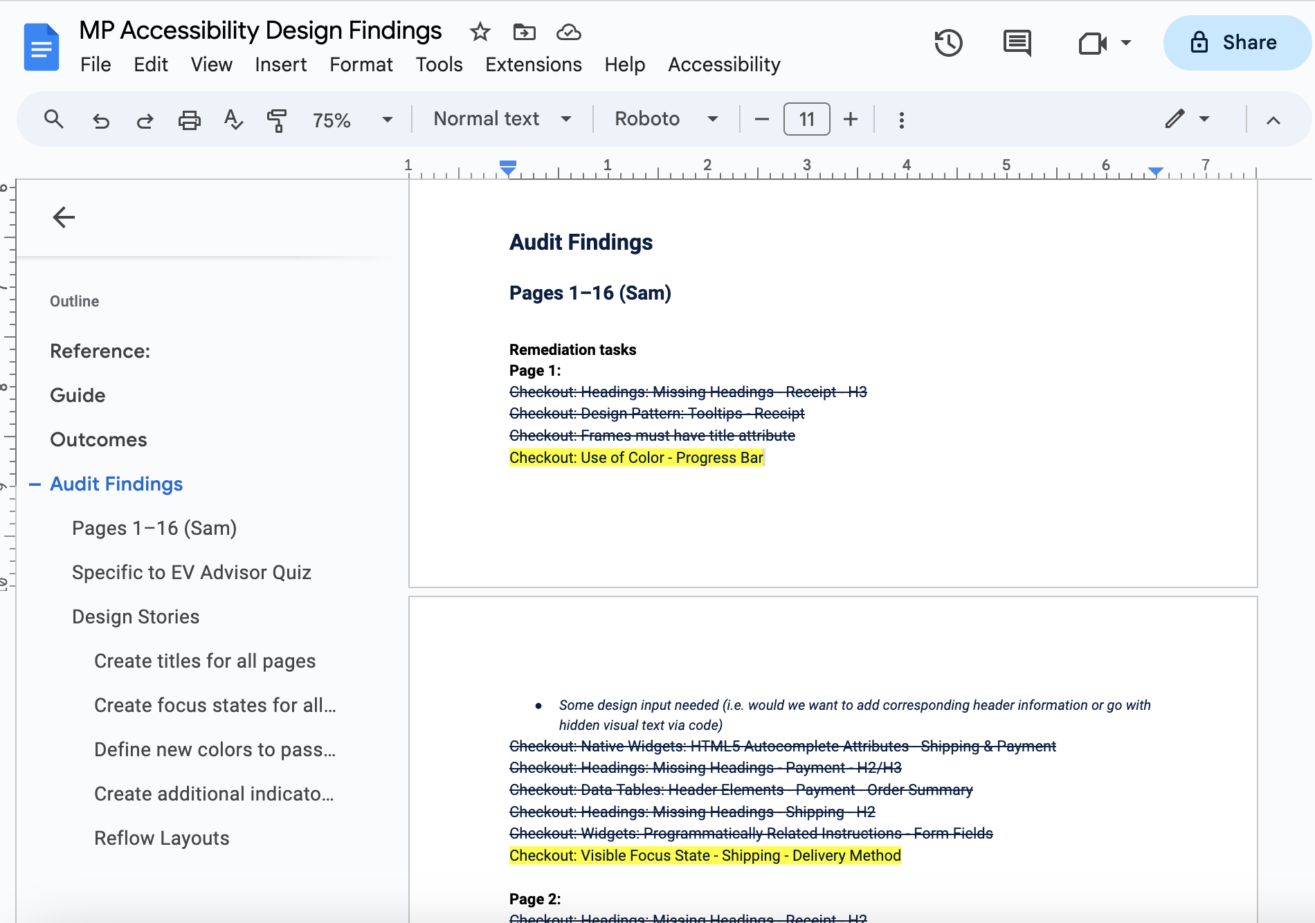
After the completion of the Marketplace accessibility audit, the Design team delved into the results, distinguishing between ADA compliance failures requiring design attention and those that were specifically code-related.
*Strikethrough lines = code only fixes & Highlighted lines = design + code fixes
The audit results for the Marketplace revealed over 100 site failures. However, many of these failures were attributed to the same component appearing on various pages of the site. This allowed the Design team to group them, providing a more realistic view of the overall design effort required.
Design Opportunities
The audit results and groupings revealed four key categories where Design could offer impactful support and recommend improvements to enhance the overall accessibility experience of the site:
Build Shared Alignment
Prior to design work, it was vital to sync with Product Managers on identified opportunities and understand Engineering team capacity.
Gaining insights into Dev's prioritized accessibility fixes enabled Design to coordinate effectively, stay ahead, and offer timely recommendations for the four categories, preventing team blocking.
Using Jira, Design created tickets for the six identified categories, estimating capacity within a 2-week sprint. This streamlined review and alignment with Product, served as a tracking mechanism, and enabled Product to create dependent Jira tickets for Engineering.
The Vision
More Inclusive Design
The existing Marketplace site presented challenges for users with low vision, colorblindness, etc. To address this, I drew insights from WCAG guidelines, educated the team on an inclusive design approach, and collaborated with the team to determine a final solution for all design failures.
Leveraging insights from WCAG research, I generated various design solutions for each of the four categories, ultimately arriving at a solution aligned with both Product and Engineering and increasing our site accessibility score.
Contrast and Color
Contrast and color usage are crucial elements of digital accessibility. It's imperative that all users can perceive content on the page. In the case of the Marketplace, failures related to contrast and color use were identified in both non-text and text instances.
Non-text Elements
The Marketplace showcased Star & Bar Rating graphics on product cards across various site pages and similar graphics on the Product Detail page. The audit results revealed that the yellow hex standard used for these graphics failed to meet the 3:1 contrast ratio.
Discovery
The yellow hex #EEB04E used for most star & bar rating graphics showed a contrast ratio failure of 1.91:1.
Exploring Uplight’s existing Design System for alternative yellow standards, I found that the Design System yellows wouldn't meet the 3:1 contrast ratio requirement against a white background.
Solution
Yellow is seldom accessible against a white background. Nevertheless, by tweaking the hue and darkening the color (creating a yellow/brown - aka gold), we could maintain the established visual impression for the customer and satisfy WCAG contrast success criteria.
Text Elements
The Marketplace identified issues with the orange color used to indicate 'Sale' and the red color used to indicate 'New,' as they failed to meet the WCAG contrast ratio of 4.5:1 for normal text contrast.
Discovery
The orange hex #EEB04E used for both the product card 'Sale' label and text indicating a discount on the site exhibited the following contrast ratios:
3.01:1 against a white background
2.73:1 against a light grey background
Solution
Similar to yellow, orange poses challenges in meeting WCAG color contrast criteria.
To use a bright, lively, and saturated hex standard, the type size must be increased to a minimum of 18px. Unfortunately, this option wasn’t feasible for all elements in our Marketplace UI without compromising visual balance.
Another explored option was to modify the orange hex standard to meet WCAG criteria, but that altered the hue to a darker and less vibrant standard, affecting the overall mood.
Lastly, we considered changing the hex color standard to something different from orange— a color we knew would pass WCAG contrast criteria while preserving our established visual balance.
In conclusion, Design proposed the following color updates for contrast compliance:
Update core orange (hex#E57702) to design system raspberry (hex#DB0860) across the site, excluding the 'Add to cart' CTA button.
Update red (hex#FB1212) used in the 'New' card badge and product detail page text to design system error red (hex#EC0239).
Update all primary buttons that currently display core orange to the site's global blue.
Insight
Acknowledging the accessibility challenges posed by the use of yellow and orange, both of which can be problematic colors, Design proposed to Product that the non-text and text color changes be implemented globally. This approach ensures that all of Uplight’s energy utility clients (customers) can offer a Marketplace that is accessible to all users.
By making these changes globally, we not only address current concerns but also proactively prevent potential future accessibility issues. Additionally, this global approach allows for greater configurability, empowering clients to adapt colors as needed.
Focus States
Visible focus states are crucial for digital accessibility. Users need to easily identify which interactive element has keyboard focus, including buttons, form inputs, etc.
A visible focus indicator can be represented by a border around the element, a vertical bar in a form field, signaling that the user can insert text, etc.
Discovery
The MP Accessibility audit identified interactive elements across the site, including checkboxes, radio groups, dismiss/clear ‘x’ icons, and buttons, lacking a visible focus state.
In 2020, Uplight underwent an ADA compliance audit for a smaller customer-facing product. During that audit, Design developed a visible focus treatment guide with focus state specifications for each interactive element. This guide proved to be a valuable resource during the Marketplace’s audit.
Discovery
To ensure consistency across products, Design consulted the focus state guide developed for the smaller product during the Marketplace audit. This involved repurposing visible focus state treatments where there was overlap between the two products. Additionally, the guide was expanded to encompass interactive elements that were not otherwise defined, ensuring comprehensive support for the Marketplace.
Insight
When addressing visible focus state failures, Design took a holistic approach, considering visible focus states across the entire product rather than focusing solely on the specific interactive elements that were failing. This approach ensured not only consistency across products but also within a product.
To support other Design teammates, the focus state guide was incorporated into the Design System for easy reference.
Reflow
If a person with low vision uses the browser zoom function, the viewed information should reflow (wrap) to fit the browser window's width without appearing cut off or necessitating both horizontal and vertical scrolling. This aligns with the principles of 'Responsive Web Design,' ensuring that content retains its information and functionality when enlarged.
The accessibility audit identified an issue with the 'Instant Rebates' tooltip used throughout the Marketplace. When zoomed in at 400%, the tooltip displayed cut-off text, requiring users to scroll both horizontally and vertically.
Marketplace Instant Rebates tooltip reflow behavior upon browser zoom and/or responsive design
Discovery
Before implementing quick fixes, we conducted a thorough examination of tooltips used in other Uplight products. What type of content did those tooltips typically contain?
Our analysis revealed that other Uplight tooltips typically held small supplementary content, usually under 100 characters. This type of content aligns well with a traditional hover tooltip, as users often access this information at a quick glance. This finding was consistent with external tooltip research as well.
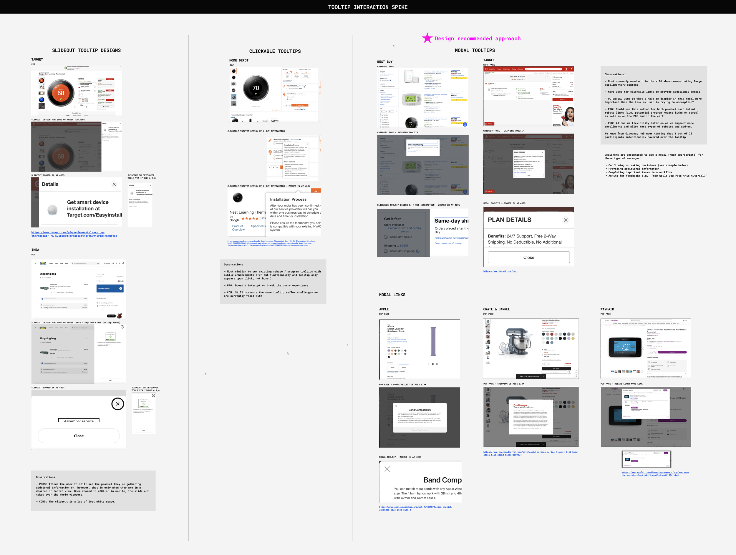
To broaden our approach, we posed the question, 'How might our existing interaction scale to support more types of product rebates, add-ons, etc.?' To answer this, Design conducted a tooltip interaction spike, exploring how other e-commerce brands communicate large supplementary content.
Tooltip Interaction Design Spike
During the spike, it became evident that the more common practice for communicating large supplementary content to users is through a modal tooltip. Modal tooltips are frequently employed for clickable links that offer additional information.
*While some sites used a slide-out tooltip, this approach often resulted in a significant amount of white empty space.
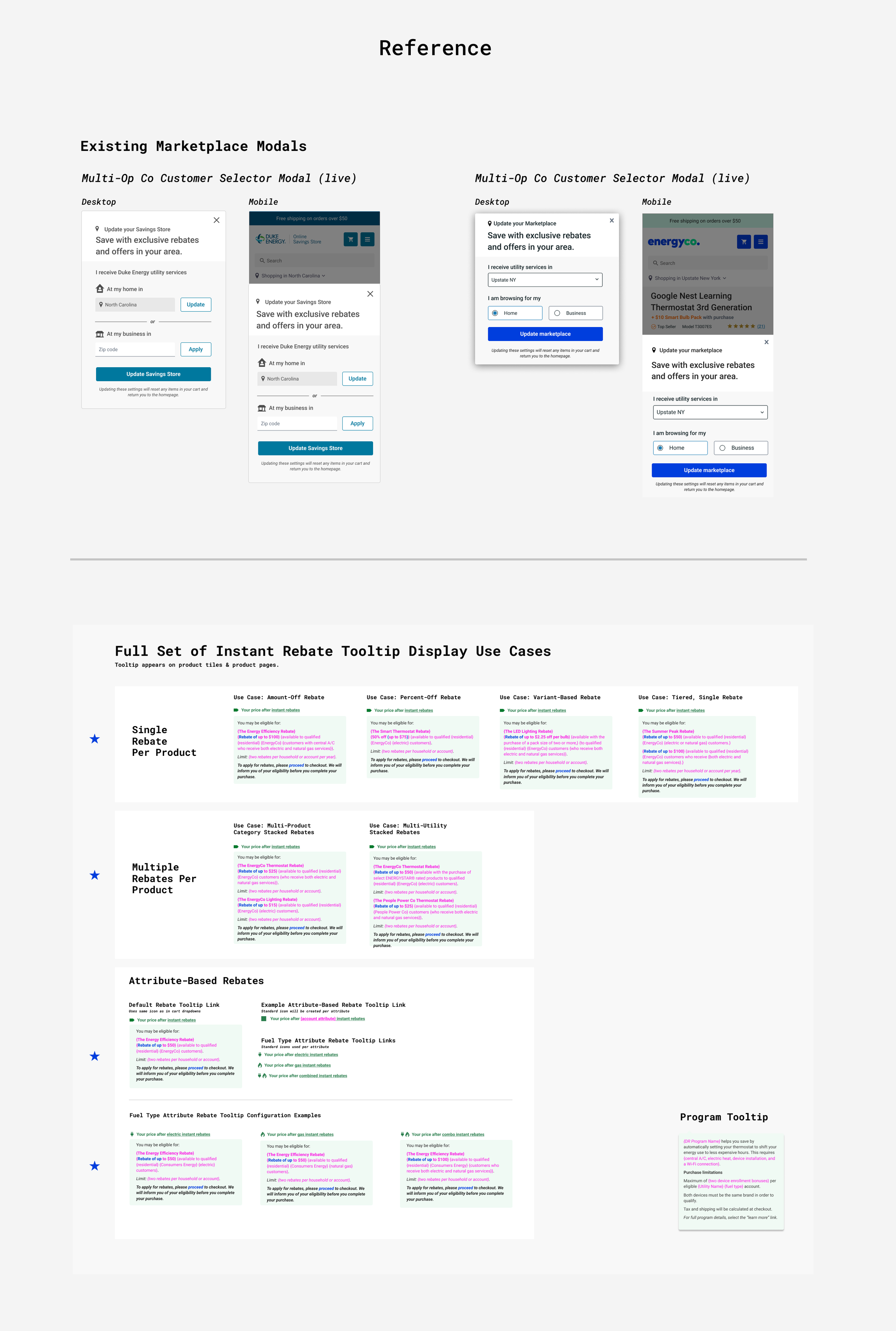
Uplight’s Marketplace platform already employed a modal treatment for a specific interaction behavior. To maintain consistency, Design utilized the existing modals to create iterations for the replacement of the ‘Instant rebate’ tooltip. Additionally, considering the various client use cases for the Marketplace supporting ‘Instant rebate’ tooltips, it was crucial to ensure the info modal tooltip would seamlessly accommodate these scenarios.
Existing Marketplace platform modals and ‘Instant rebate’ tooltip use cases
As with any recommendation, there are pros and cons to consider. In the case of the modal tooltip:
Pro’s
Supports all site instances (pages) with 'Instant rebates' and 'Program rebates' text links that provide additional information.
Allows flexibility and scalability for future support of more utility enrollments, types of rebates, and product add-ons.
Offers utility clients a smoother way to display stacked and more complex rebates.
Con
Blocks background content for the user, raising the question, 'Is the information in this modal more important than the task the user is trying to accomplish?' In short: yes.
Past user testing on the hover tooltip interaction revealed that only 1 out of 20 participants intentionally hovered over the tooltip. The Design spike led us to consider that most users may be accustomed to clicking a link rather than hovering over it.
Ultimately, the pros outweighed the cons. Design proposed the modal tooltip interaction to Product and Dev, and the team agreed to move forward with this approach.
Transformed the ‘Instant rebate’ hover tooltip into an information modal interaction to enhance reflow support.
Use of Color
When it comes to color, it should not be the sole means of conveying information, prompting user actions, or eliciting responses.
Users with partial sight, older individuals with limited color vision, or those with color-blindness may face challenges in distinguishing colors. Designing any product with these considerations in mind is crucial to ensuring information is effectively conveyed beyond color.
Discovery
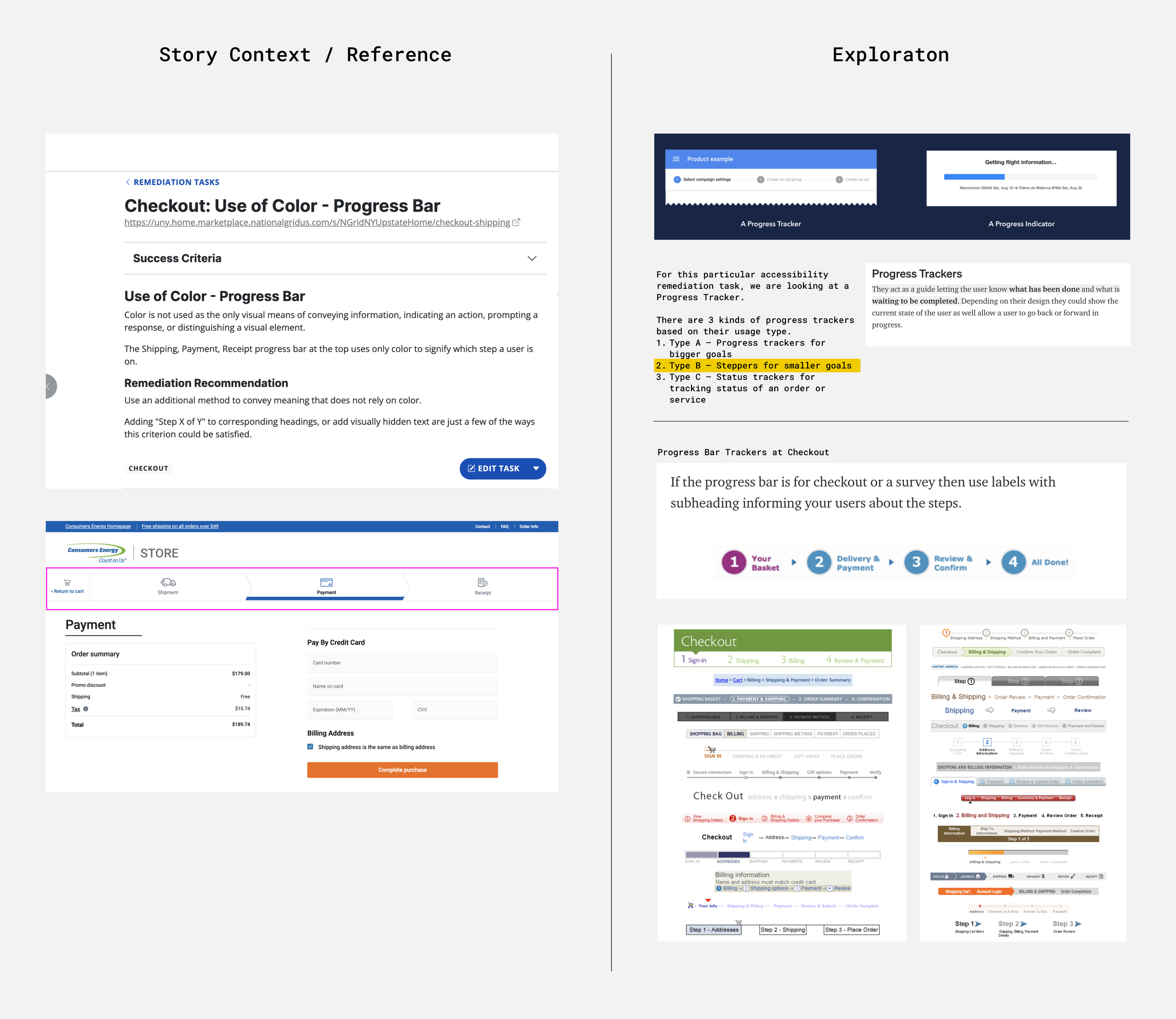
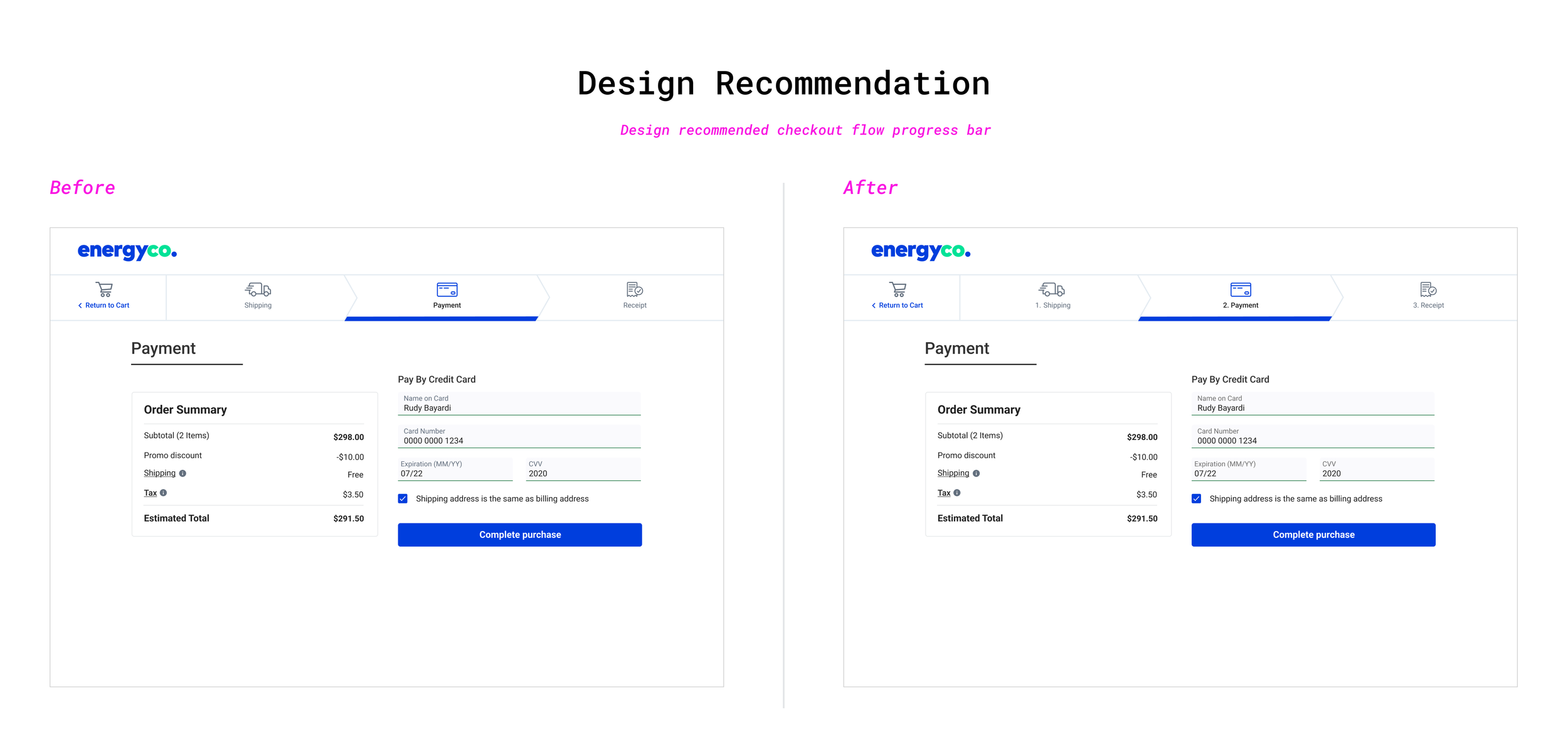
The accessibility audit identified an issue with the progress bar in the Checkout flow. It solely used the site's global blue underline to indicate to users which step they were on in the checkout process, which consists of three steps. Research indicated that, in this case, we needed a progress tracker tailored for a smaller goal.
Solution
Adding a step number in front of each step title enhanced the user experience by clearly communicating that there is an end in sight and helping users understand what is expected of them to complete their purchase.
The Marketplace Checkout Flow before accessibility updates (left) to after (right)
Conclusion
As Design addressed each of the four categories—Color & contrast, focus states, reflow, etc.—reviews were led with Product and Engineering. The team walked through Design's proposed recommendations, addressed concerns, and aligned on next steps.
By the close of 2021 and the onset of 2022, we successfully addressed all accessibility issues in Marketplace, achieving an impressive 95% site compliance rating— a substantial leap from the initial 70% in 2021. Additionally, design updates implemented for the 'Instant rebate' tooltip were extended to enhance other tooltips across the Marketplace.
I take pride in my contribution to this project, where I:
Learned and developed my Inclusive Design skills.
Collaborated in making a highly sold product accessible to users of all kinds.
Worked with Product to prioritize Design and Engineering capacity on future products, embedding accessibility in the product scope of work and addressing those needs early on. This approach ultimately saved time and money for the business and our clients.


